
Overview
In the Boxtout planning series, we created a task to show the user a custom dialog if the region doesn’t exist in the region’s collection. This tutorial will go over a step-by-step guide of creating the custom dialog using the DialogService that we’re use to using in the Stacked architecture.
Setup
This will be built using the last point of boxtout as the starting point. Since it’s completely independent we can branch off main at any point and build the UI and set it up.
Building the Custom Dialog
To setup a custom dialog with the DialogService you need to register builders. Each builder is mapped to a different value, we’ll use enums. Create a new folder named enums in the lib folder inside it create a file called dialog_type.dart . This enum will have a value for each custom dialog we will build, we will use this enum to decide which custom dialog should to show, for now we just need one :
/// The type of dialog to show
enum DialogType { basic }
Under the lib/ui folder, we’ll create a new folder called shared. In that folder create a new file called setup_dialog_ui.dart, we’ll use it to register our builders with the service so that later on we can call the builder from our business logic. We’ll create a new function called setupDialogUi and the first thing we’ll do is get the DialogService. Then we create a Map of builders that will map to the enum types we created. This is where we’ll add more enums and builders as we go along. The builder is a function that returns a widget and provides us with the dialog request as well as the completer to close the dialog with.
void setupDialogUi() {
	final dialogService = locator<DialogService>();

	final builders = {
		DialogType.basic: (BuildContext context, DialogRequest request,
		Function(DialogResponse) completer) =>
		BasicDialog(request: request, completer: completer),
		};

	dialogService.registerCustomDialogBuilders(builders);
}
To keep code maintenance to the highest level you should make each of the widgets into its own widget and construct that instead of building the UI inline. We’ll create a new folder in shared called dialogs and inside a new file called basic_dialog.dart . In that file we’ll create a stateless widget called BasicDialog that will have the dialog widget as a child _BasicDialogContent as it’s child. This widget will take in the request and completer.
class BasicDialog extends StatelessWidget {
  final DialogRequest request;
  final Function(DialogResponse) completer;
  const _BasicDialog({Key? key, required this.request, required this.completer})
      : super(key: key);

  @override
  Widget build(BuildContext context) {
    return Dialog(
        backgroundColor: Colors.transparent,
        child: _BasicDialogContent(request: request, completer: completer));
  }
}
Let’s build the dialog content UI:
We’ll add new colors to box_ui package inside box_ui/lib/src/shared/app_colors.dart file. These colors we’ll use in the dialog UI.
const Color kcRedColor = Color(0xfff44336);
const Color kcOrangeColor = Color(0xffff9800);
Since we know the dialog will require three different types for user feedback we’ll create an enum that reflects that. Under lib/enums/ create a new file basic_dialog_status.dart
enum BasicDialogStatus { success, error, warning }Then we’ll create a new folder in the shared folder called dialogs lib/ui/shared/dialogs/basic_dialog.dart with a stateless widget _BasicDialogContent that takes in the DialogRequest and the completer function. The root of this dialog will be a Stack.
class _BasicDialogContent extends StatelessWidget {
  const _BasicDialogContent({
    Key? key,
    required this.request,
    required this.completer,
  }) : super(key: key);

  final DialogRequest request;
  final Function(DialogResponse dialogResponse) completer;

  @override
  Widget build(BuildContext context) {
    return Stack(
      clipBehavior: Clip.none,
      alignment: Alignment.topCenter,
      children: [

      ],
    );
  }
}
The first thing in the Stack will be a Container. This container will have a margin using screenWidthPercentage, we’ll give it a padding to keep the content centered and we’ll set the styling to be white and set a borderRadius of 24. Inside the container we’ll set a Column that has a mainAxis set to min. Inside we’ll have a subheading that takes the title, we’ll have a body that takes description and a Row that has a secondaryButton if not null and a TextButton that’s set to the primary color.
Container(
margin: EdgeInsets.symmetric(
horizontal: screenWidthPercentage(context, percentage: 0.04),
),
padding: const EdgeInsets.only(
top: 32,
left: 16,
right: 16,
bottom: 12,
),
decoration: BoxDecoration(
color: Colors.white,
borderRadius: BorderRadius.circular(24),
),
child: Column(
mainAxisSize: MainAxisSize.min,
children: [
verticalSpaceSmall,
BoxText.subheading(
request.title ?? '',
align: TextAlign.center,
),
verticalSpaceSmall,
BoxText.body(
request.description ?? '',
align: TextAlign.center,
),
verticalSpaceMedium,
Row(
mainAxisAlignment: MainAxisAlignment.spaceAround,
children: [
if (request.secondaryButtonTitle != null)
TextButton(
onPressed: () =>
completer(DialogResponse(confirmed: false)),
child: BoxText.body(
request.secondaryButtonTitle!,
color: Colors.black,
),
),
TextButton(
onPressed: () => completer(DialogResponse(confirmed: true)),
child: BoxText.body(
request.mainButtonTitle ?? '',
color: kcPrimaryColor,
),
),
],
),
],
),
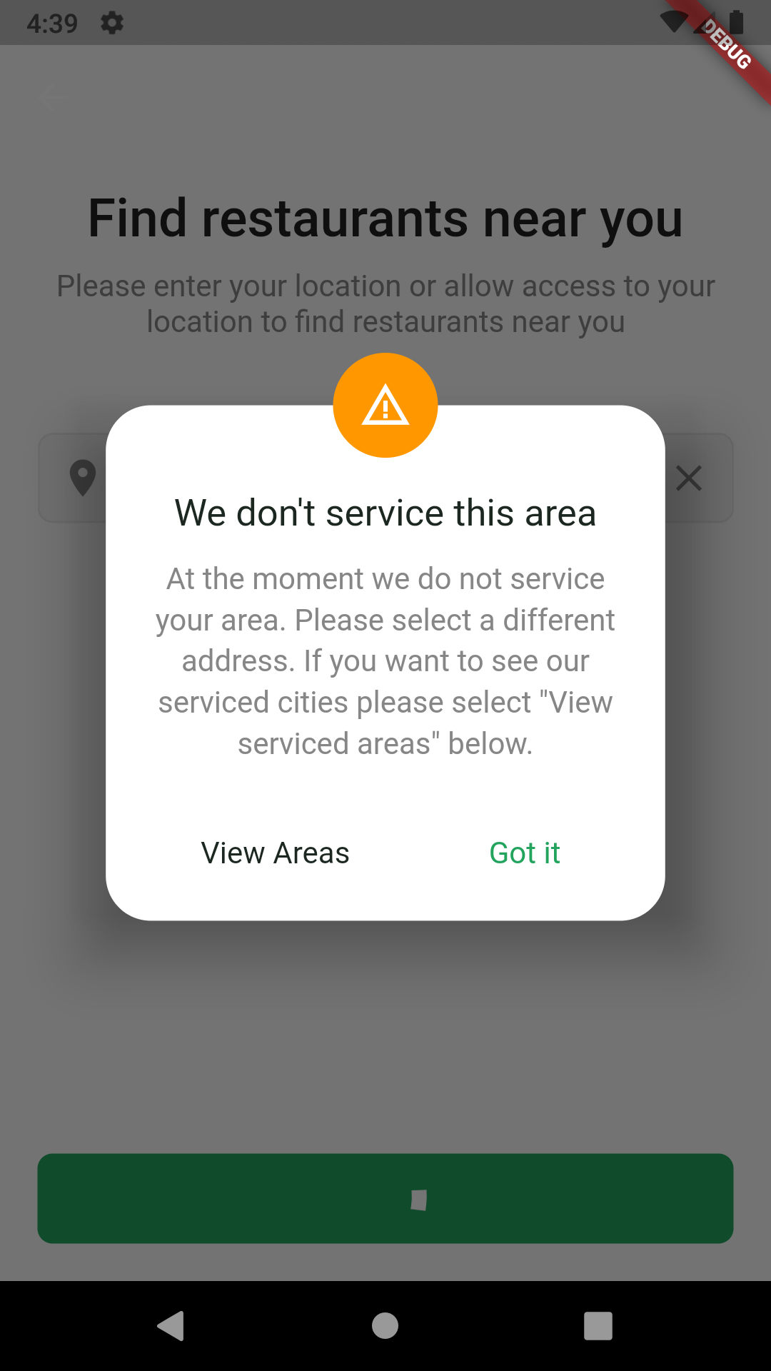
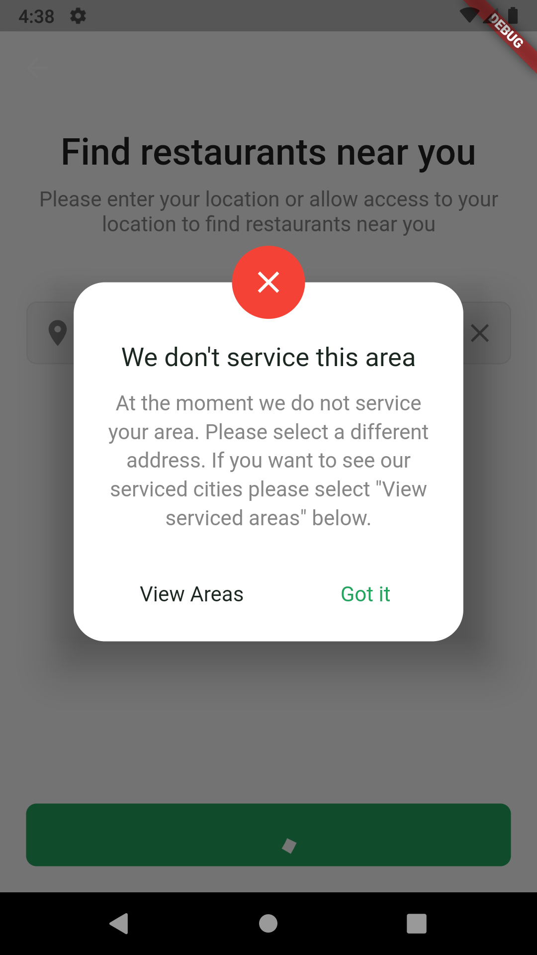
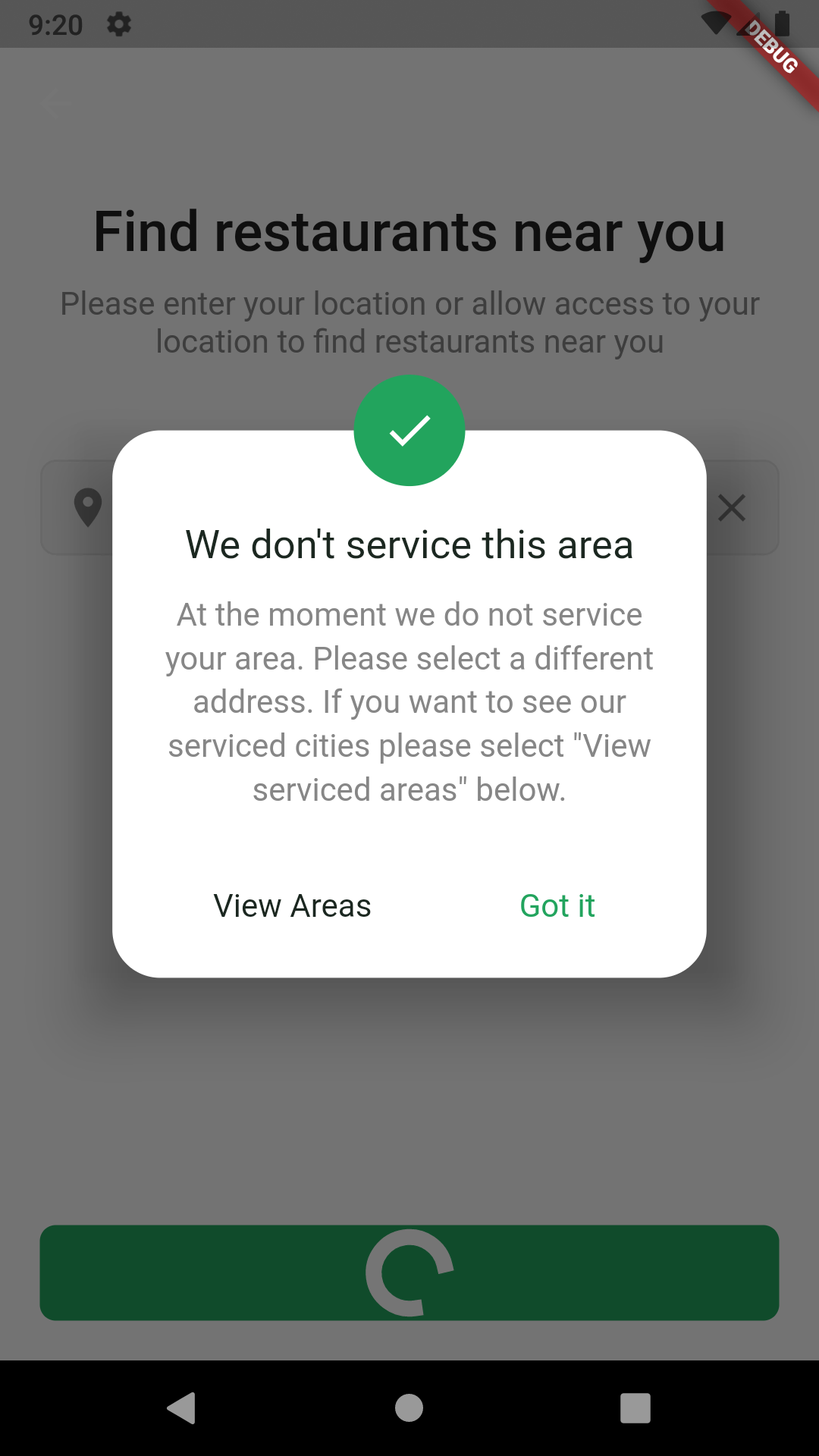
)The last thing we’re adding is a circular avatar that will represent the three dialog status as an enum ✅ success: shows green with a tick ❌ error: shows red with close button cross ⚠ warning: shows orange with triangle & exclamation mark
   Positioned(
    top: -28,
    child: CircleAvatar(
      minRadius: 16,
      maxRadius: 28,
      backgroundColor: _getStatusColor(request.customData),
      child: Icon(
        _getStatusIcon(request.customData),
        size: 28,
        color: Colors.white,
      ),
    ))
For the _getStatusColor function we should show the dialog status depending on request.customData which will be provided through the DialogRequest, we will make success the default status if customData is not provided. The two functions to get the correct avatar and icon will be a basic switch statement that returns the correct value.
Color _getStatusColor(dynamic customData) {
  if (customDatais BasicDialogStatus)
    switch (customData) {
      case BasicDialogStatus.error:
        return kcRedColor;
      case BasicDialogStatus.warning:
        return kcOrangeColor;
      default:
        return kcPrimaryColor;
    }
  else {
    return kcPrimaryColor;
	}
}

IconData _getStatusIcon(dynamic regionDialogStatus) {
  if (regionDialogStatus is BasicDialogStatus)
    switch (regionDialogStatus) {
      case BasicDialogStatus.error:
        return Icons.close;
      case BasicDialogStatus.warning:
        return Icons.warning_amber;
      default:
        return Icons.check;
    }
  else {
    return Icons.check;
	}
}
Returning Data from Custom Dialog
The builder function supplied for a Custom dialog builder has a parameter of type Function(DialogResponse) as the last parameter. Calling the completer function and passing in a DialogResponse object will return it to the caller that’s awaiting on the dialog response UI. So when you have a tap handler in your dialog and you want to close the dialog, use the completer(DialogResponse()) function.
Replace the comment //secondaryButton onPressed with this to return a not confirmed DialogResponse when you hit the secondary button
completer(DialogResponse(confirmed: false));Replace the comment //mainButton onPressed with this to return a confirmed DialogResponse when you hit the main button
completer(DialogResponse(confirmed: true));Usage
To make use of our custom dialog we have to register our dialog. Go to your main.dart file, after your locator registration, call setupDialogUi() to register your custom dialogs.
Future main() async {
  WidgetsFlutterBinding.ensureInitialized();
  await Firebase.initializeApp();

  if (USE_EMULATOR) {
    await _connectToFirebaseEmulator();
  }

  setupLocator();
  // here we rigester our custom dialog
  setupDialogUi();
  runApp(MyApp());
}
Now in your AddressSelectionViewModel, you can make use of the dialog as follows.
final dialogResult = await _dialogService.showCustomDialog(
    variant: DialogType.basic,
    customData: BasicDialogStatus.error,
    title: CityNotServicedDialogTitle,
    description: CityNotServicedDialogDescripton,
    secondaryButtonTitle: CityNotServicedDialogSecondaryButton,
    mainButtonTitle: CityNotServicedDialogMainButton,
);

if (!dialogResult!.confirmed) {
  // take me to a screen that has a list of all the region documents available
}
If you want to use error, warning styles of the dialog you just need to add BasicDialogStatus.error , BasicDialogStatus.warning respectively to the showCustomDialog customData field. The last thing to do is create the constants for the button titles in the app_string.dart file.
const String CityNotServicedDialogMainButton = 'Got it';
const String CityNotServicedDialogSecondaryButton = 'View Areas';
The Final result
That’s how you setup a Custom Dialog in Flutter. Thank you for reading, we’ll see you again next week.