Let’s get to one of the most exciting features on the Horizon for Flutter. Web Development using Flutter. I am so excited for this feature because I’ve always struggled with web development. Now I can be at the forefront and learn with you how to do the basics together.
The goal of this series will be to create a set of tutorials that can be followed to go from no Flutter web experience to being able to build a basic web application. Today we’ll look 3 things. Creating a web project, Building a basic UI and deploying the code.
Create a Flutter Web project
To start off you have to switch over to the master channel. Run the following command in your terminal
flutter channel masterThen upgrade your flutter to the latest version from master.
flutter upgradeWhen that’s complete you want to enable web support.
flutter config --enable-webNow when you create a project it’ll be web enabled and you can run it in the browser. To see if your env is setup properly run
flutter devicesThen onto the creation. You use the normal create command for the flutter application.
flutter create the_basicsBuilding a basic UI
The UI we’ll be building today will be the landing page for this set of series that we’ll pretend is a course.
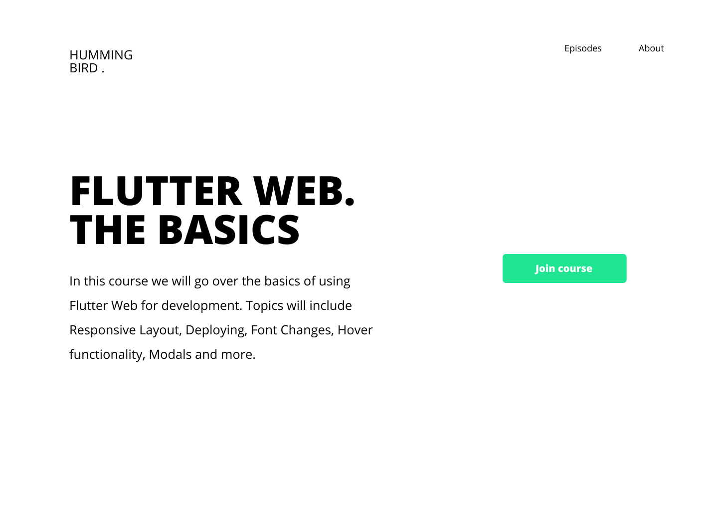
It follows a basic UI layout for a web view. So nothing special there. Open up the_basics project in your IDE of choice (I’m using VS code). We’ll start off by clearing out the main file and setting the HomeView as the scaffold body.
class MyApp extends StatelessWidget {
  @override
  Widget build(BuildContext context) {
    return MaterialApp(
      title: 'Flutter Demo',
      theme: ThemeData(
        primarySwatch: Colors.blue,
      ),
      home: HomeView()
    );
  }
}
Under the lib folder you can create a new folder called views, inside that folder create a new folder called home, inside that folder create a new file called home_view.dart
class HomeView extends StatelessWidget {
  const HomeView({Key key}) : super(key: key);

  @override
  Widget build(BuildContext context) {
    return Scaffold();
  }
}
The HomeView will be divided into the following sections.
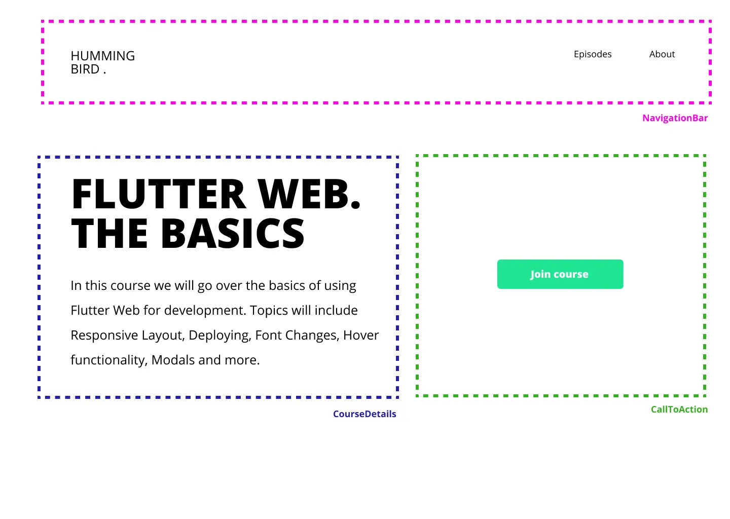
Navigation Bar
We’ll start the UI building process top-down. Create a new folder called widgets in the lib folder, under it create a new folder called NavigationBar and inside a new file, navigation_bar.dart. I won’t be doing too much step by step instructions. If you want to see my UI building process you can check out this tutorial for a detailed walk through. The navigation bar will be a container of height 100, the child will be a row that has the mainAxisAlignment set to spaceBetween. The first child is the image and the second child is a row with two _NavBarItem widgets. Which is a Text with font size 18.
class NavigationBar extends StatelessWidget {
  @override
  Widget build(BuildContext context) {
    return Container(
      height: 100,
      child: Row(
        mainAxisAlignment: MainAxisAlignment.spaceBetween,
        children: <Widget>[
          SizedBox(
            height: 80,
            width: 150,
            child: Image.asset('assets/logo.png'),
          ),
          Row(
            mainAxisSize: MainAxisSize.min,
            children: <Widget>[
              _NavBarItem('Episodes'),
              SizedBox(
                width: 60,
              ),
              _NavBarItem('About'),
            ],
          )
        ],
      ),
    );
  }
}

class _NavBarItem extends StatelessWidget {
  final String title;
  const _NavBarItem(
    this.title, {
    Key key,
  }) : super(key: key);

  @override
  Widget build(BuildContext context) {
    return Text(
      title,
      style: TextStyle(fontSize: 18),
    );
  }
}
Add an image to Flutter
You can find the logo image and some other resources here here. Download it, then create a new folder in the root called assets. Place the logo.png in that folder. Head over to the pubspec.yaml file and add it as an asset.
assets:
  - assets/logo.png
Add a custom Font
The last thing to change before it matches our design is the Font of the NavItems. The fonts are in the zip file you downloaded above for the logo, move it into a folder under the assets folder called fonts. Open up the pubspec.yaml file and add it as a font with set weights for the two fonts.
fonts:
  - family: Open Sans
    fonts:
      - asset: assets/fonts/OpenSans-ExtraBold.ttf
        weight: 800
      - asset: assets/fonts/OpenSans-Regular.ttf
        weight: 400
To get the font to apply to the entire application we will set the textTheme of the app in the main.dart file.
class MyApp extends StatelessWidget {
  @override
  Widget build(BuildContext context) {
    return MaterialApp(
        title: 'Flutter Demo',
        theme: ThemeData(
            primarySwatch: Colors.blue,
            textTheme: Theme.of(context).textTheme.apply(
                  fontFamily: 'Open Sans',
                )),
        home: HomeView());
  }
}
Finally we can add the NavigationBar to the HomeView UI and we’ll be able to see our UI.
class HomeView extends StatelessWidget {
  const HomeView({Key key}) : super(key: key);

  @override
  Widget build(BuildContext context) {
    return Scaffold(
      backgroundColor: Colors.white,
      body: Column(children: <Widget>[
          NavigationBar()
        ],),
    );
  }
}
If you run the code you’ll see that the navigation bar is squashed to the top. We want the content of the website not to completely go edge to edge, I like to contain my content in a narrow portion in the middle that I can control. So for that we’ll create another widget. In the widgets folder create a new folder called centered_view and inside a new file called centered_view.dart
class CenteredView extends StatelessWidget {
  final Widget child;
  const CenteredView({Key key, this.child}) : super(key: key);

  @override
  Widget build(BuildContext context) {
    return Container(
      padding: const EdgeInsets.symmetric(horizontal: 70.0, vertical: 60),
      alignment: Alignment.topCenter,
      child: ConstrainedBox(
          constraints: BoxConstraints(maxWidth: 1200),
          child: child,
          ),
    );
  }
}
This widget will centre a a child in a ConstrainedBox that takes up a max width of 1200. This means the content of this view will never stretch more than 1200. You can pass this in to modify per view but I’m not doing that now.
Now we can go ahead and wrap the home_view body with a CenteredView.
class HomeView extends StatelessWidget {
  ...
  @override
  Widget build(BuildContext context) {
    return Scaffold(
      backgroundColor: Colors.white,
      body: CentredView(
        child: Column(
          children: <Widget>[
            NavigationBar(),
          ],
        ),
      ),
    );
  }
}
When you run this now you should have a nicely padded toolbar with some spacing on the side.

Course Details
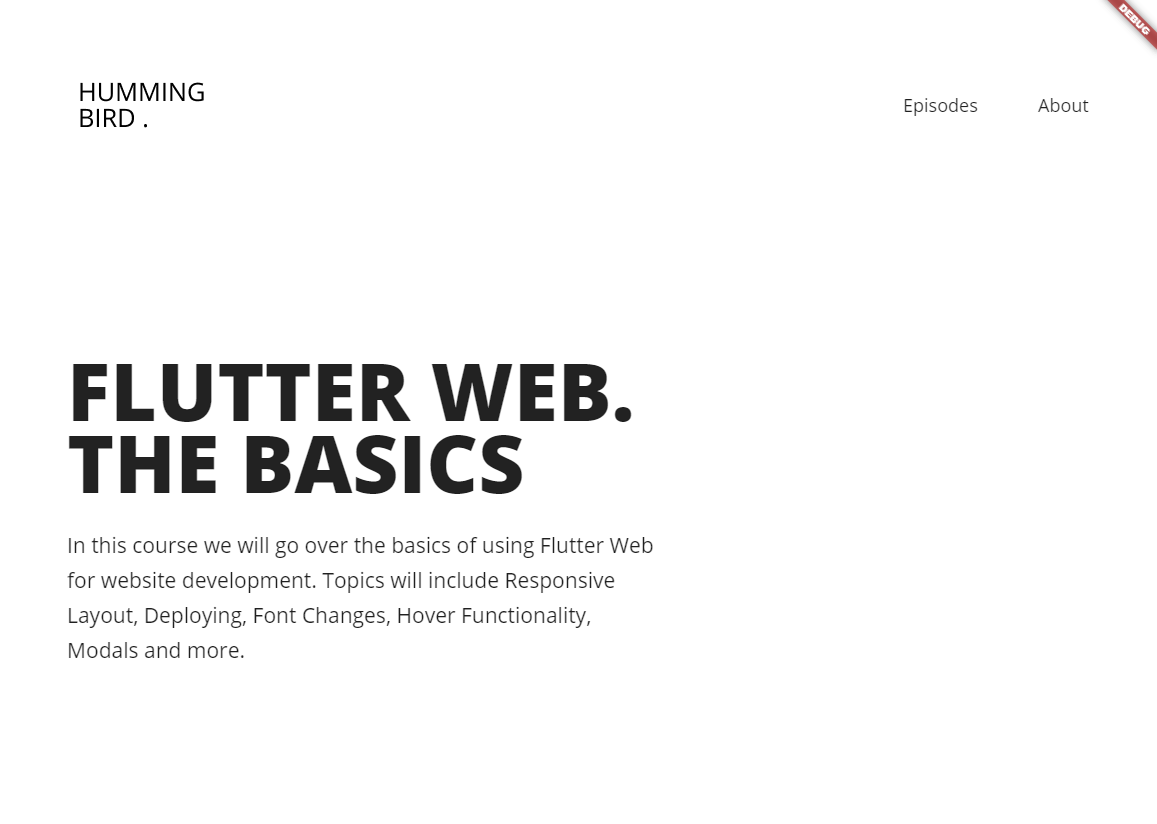
Next up we’ll build the course details widget which will take up the left side of the screen body. It will have a title with fontWeight 800 and some body text with regular weight font. We’ll place it in a column. Under widgets create a new folder called course_details and inside a file called course_details.dart
class CourseDetails extends StatelessWidget {
  const CourseDetails({Key key}) : super(key: key);

  @override
  Widget build(BuildContext context) {
    return Container(
      width: 600,
      child: Column(
        crossAxisAlignment: CrossAxisAlignment.start,
        mainAxisAlignment: MainAxisAlignment.center,
        children: <Widget>[
          Text(
            'FLUTTER WEB.\nTHE BASICS',
            style: TextStyle(
                fontWeight: FontWeight.w800, fontSize: 80, height: 0.9),
          ),
          SizedBox(
            height: 30,
          ),
          Text(
            'In this course we will go over the basics of using Flutter Web for website development. Topics will include Responsive Layout, Deploying, Font Changes, Hover Functionality, Modals and more.',
            style: TextStyle(fontSize: 21, height: 1.7),
          ),
        ],
      ),
    );
  }
}
We’ll give it a fixed width (we’ll handle responsiveness later). The title has a height factor of 0.9 to bring the lines closer to each other and the details have a factor of 1.7 to push them further apart.
We’ll add this in the HomeView in an Expanded child, as the first item of a row. Update the home_view build method to look like this.
Widget build(BuildContext context) {
    return Scaffold(
      backgroundColor: Colors.white,
      body: CentredView(
        child: Column(
          children: <Widget>[
            NavigationBar(),
            Expanded(
              child: Row(children: [
                CourseDetails(),
              ]),
            )
          ],
        ),
      ),
    );
  }
If you save the code now you should see it updating to look something like this.
Call to Action
Lastly we create a call to action widget that we’ll use for our Join Course button. Under the widgets folder create a new folder called call_to_action and inside create a new file called call_to_action.dart
class CallToAction extends StatelessWidget {
  final String title;
  const CallToAction(this.title);

  @override
  Widget build(BuildContext context) {
    return Container(
      padding: const EdgeInsets.symmetric(horizontal: 60, vertical: 15),
      child: Text(
        title,
        style: TextStyle(
          fontSize: 18,
          fontWeight: FontWeight.w800,
          color: Colors.white,
        ),
      ),
      decoration: BoxDecoration(
          color: Color.fromARGB(255, 31, 229, 146),
          borderRadius: BorderRadius.circular(5)),
    );
  }
}
Then we’ll place this CallToAction inside the home view next to the CourseDetails. It will be in an expanded widget, inside a Center widget and take in the text ‘Join Course’. The final HomeView will look like this.
class HomeView extends StatelessWidget {
  const HomeView({Key key}) : super(key: key);

  @override
  Widget build(BuildContext context) {
    return Scaffold(
      backgroundColor: Colors.white,
      body: CentredView(
        child: Column(
          children: <Widget>[
            NavigationBar(),
            Expanded(
              child: Row(children: [
                CourseDetails(),
                Expanded(
                  child: Center(
                    child: CallToAction('Join Course'),
                  ),
                )
              ]),
            )
          ],
        ),
      ),
    );
  }
}
And that’s it for the UI. If you open the browser with the code running you can see it looks like the design. It’s not responsive, YET, but we have a way of dealing with that. So as you see, the Flutter UI building is exactly the same, which is literally heaven for me. No more CSS styling required will be very very very great for someone like me. The last thing to do is to deploy or host the web app.
Hosting the App
We’ll use firebase for the hosting. Make sure you have a firebase account, go to the console and create a new project called TheBasics. Inside the root of your project run
firebase init hostingChoose to select an existing project. Select TheBasics. For the public director enter build/web, when asked to configure as a single page app type ‘y’ and enter. When they ask if you want to overwrite the index file select ‘Y’ for yes.
Now we’ll build the files that will get deployed.
flutter build webThen deploy the website.
firebase deploy --only hostingWhen this is done you’ll get the link to view the website. This is where you’ll see the first issue Flutter web has that shows it’s not ready for production. It takes a looooooong time for your web content to render and show up. We’re not worried about that right now, the Flutter team will hopefully take care of that.
That’s it for this weeks tutorial, I had to cut it short but this will give us a good place to start for the next set of web related functionalities.

