
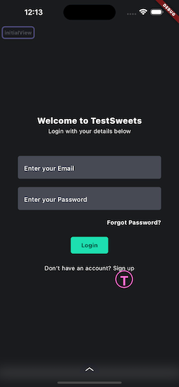
Creating automated test cases using TestSweets is an easy process.
But testing on multiple screen sizes was not as easy as setting up the tests.
With the release of the new version we’ve added the ability to adjust your automation points for different screen sizes ensuring 100% accuracy across devices.
In this article I want to give you 3 tips to effectively use the new responsive functionality to improve your automation test cases.
1. Originally Capture on the Average Device Size
The most common resolution for smart phones is 720×1280 or around there, depending on the make.
If you’re capturing your first set of automation points I would recommend that you capture on this device, because it’s in the middle of the small → large screen sizes.
This favors the responsive sizing calculation that we use to adjust the points based on the screen size, and also makes it less of a jump between different screen sizes when you start adding smaller and larger devices.
This leads me to the second tip.
2. Adjust on the smallest and largest devices you support
Now that you have captured your automation points it’s a good idea to run the app, in capture mode, on a larger device to see if the automation points overlap with the widgets that you want to interact with.
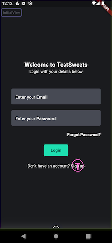
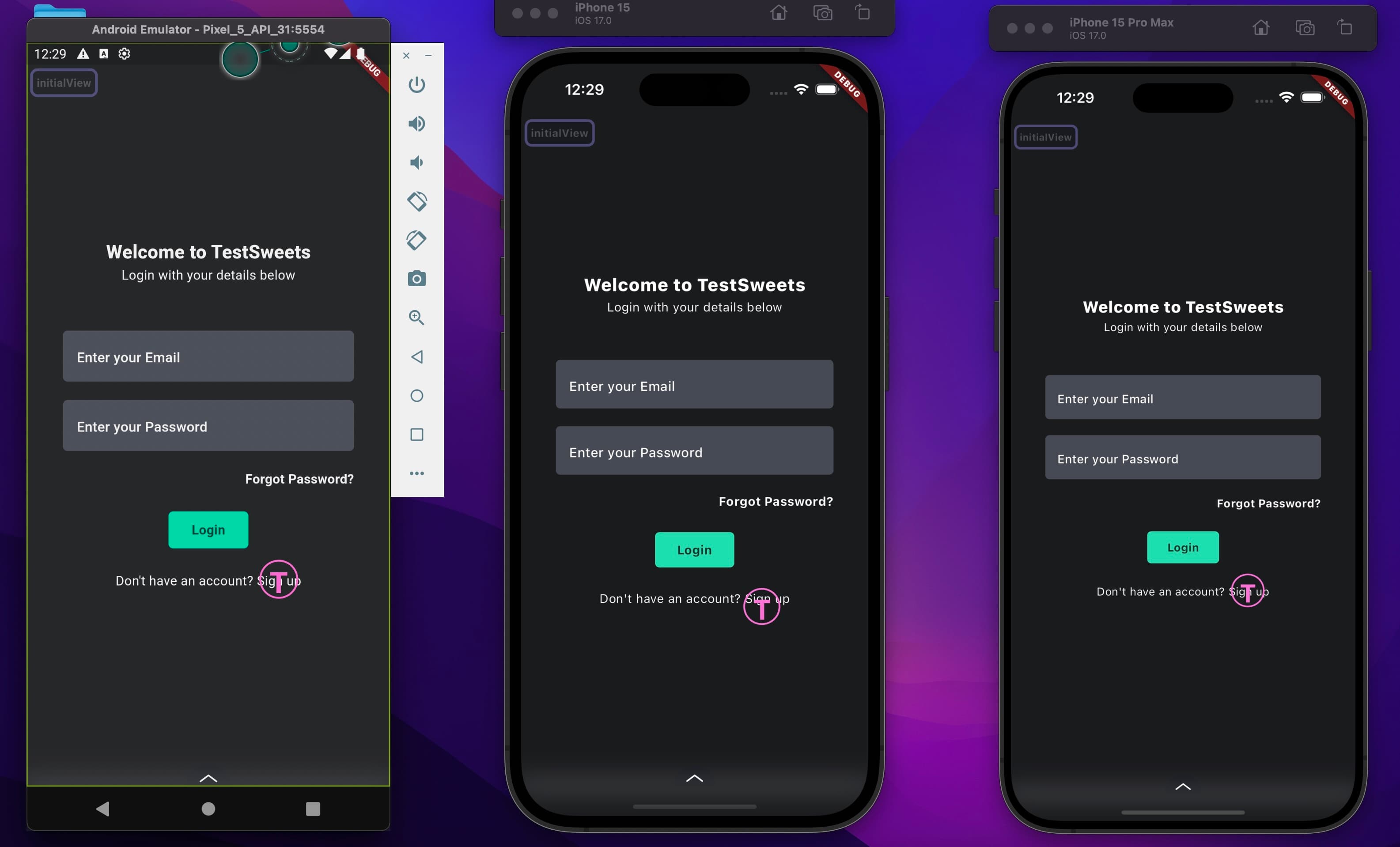
Here is an example of an interaction point captured on a medium device.
And here is how it looked on a much larger device.
As you can see the shift is quite big.
To fix this we perform a long tap on the automation point and move it to the same position it appeared originally.
TestSweets will keep track of the new position for this specific screen size and and place it there in all future runs.
The other cool thing that TestSweets will do, is when it runs on a new device, that you haven’t captured on before, it will choose the closest captured screen size to calculate the placed position.
See the image below, on the left is a small device, on the right is a larger device, and in the middle is a medium device.
We only adjusted on the left and right device, and TestSweets placed the automation point on the middle device.
3. Check and Adjust on different form factors
The final tip only applies if your app has to run on different form factors like tablet or desktop.
I recommend that you run your app on the average size and then adjust accordingly based on the offset.
With the solution you can add an infinite number of screen sizes as you adjust the points and TestSweets will use the correct one when the tests are run.
Bonus tip: TestSweets also takes into account different orientations, so if you have a different layout per orientation, run the app in that orientation and make your adjustments to your automation points.
Good luck with your test automation.
Let’s work together
If you’re a company working with Flutter, with revenue higher than $3m per year, we have an enterprise offer for you.
We will write and maintain all your automated tests for you and your team.
Reach to automation@filledstacks.com if you want to work with a team focused on team performance through automation.
If you want to start automating your quality process yourself, here’s a 7-day free trial to try out TestSweets.