Getting the screen size in Flutter is trivial, and not verobose (for the most part). This is how you do it.
var screenSize = MediaQuery.of(context).size;
var width = screenSize.width;
var height = screenSize.height;
In certain layouts will require you to make some calculations on those sizes. You’ll also have to re-use them in different widgets. Take the image below.
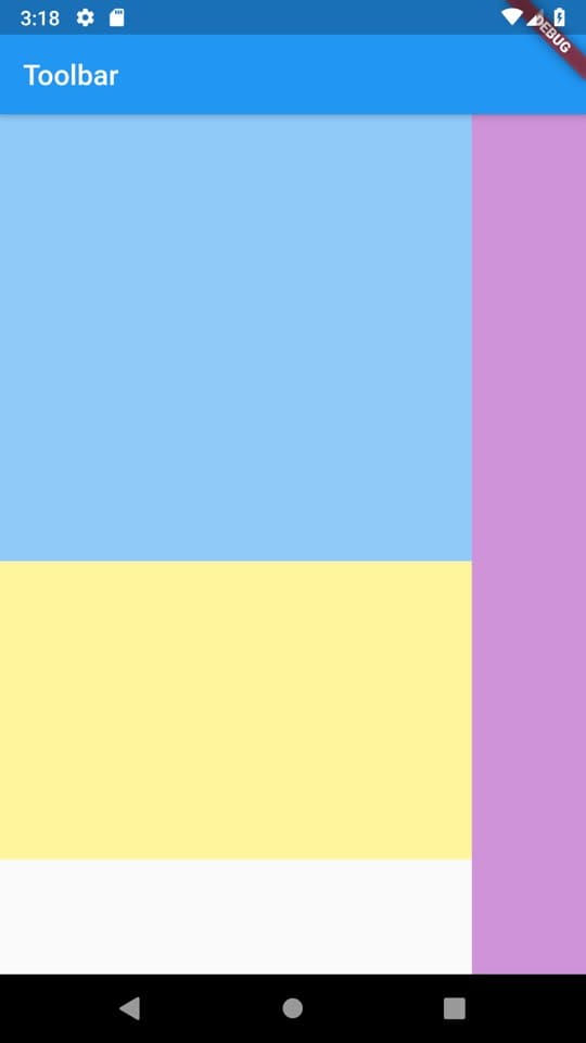
Here you need to do a few things. Have a container half the size of the screen height (blue), another container a third the size of the screenheight(yellow) and a toolbar on the right (purple), while taking into account the height of the AppBar that’s added to the Scaffold. Let’s see how this would look using reducers.
Let’s start by making a file called screensize_reducers.dart and we’ll add a screenSize function first with basic screenHeight and screenWidth reducers that divides the height by a number we pass in. Default 1.
Size screenSize(BuildContext context) {
  return MediaQuery.of(context).size;
}

double screenHeight(BuildContext context, {double dividedBy = 1}) {
  return screenSize(context).height / dividedBy;
}

double screenWidth(BuildContext context, {double dividedBy = 1}) {
  return screenSize(context).width / dividedBy;
}
Make sure you have a running project and then make your build method look like this.
class Home extends StatelessWidget {
  @override
  Widget build(BuildContext context) {
    return Scaffold(
      body: Column(
        children: <Widget>[
        Container(
          color: Colors.blue[200],
          height: screenHeight(context,
              dividedBy: 2),
        ),
        Container(
            color: Colors.yellow[200],
            height: screenHeight(context,
                dividedBy: 3))
      ]),
    );
  }
}
You should be seeing something like this.

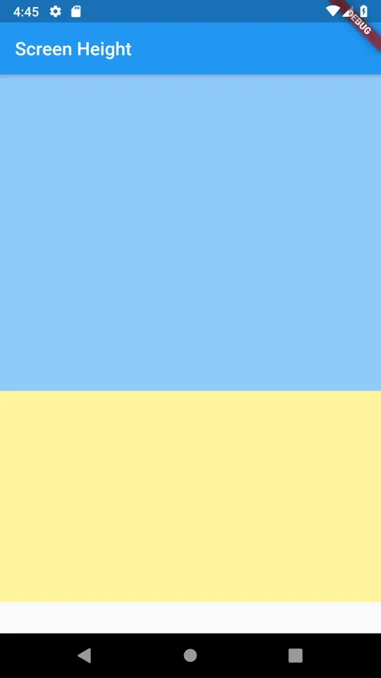
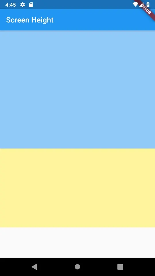
The one problem with using the screen height provided by the MediaQuery is that when you use a toolbar it doesn’t account for it so the height is always wrong given the usable space. Lets add a toolbar to the scaffold and update our screenHeight method to take in a new value. We’ll create a new function to make use of this value.
double screenHeight(BuildContext context,
  {double dividedBy = 1,
  double reducedBy = 0.0}) {
  return (screenSize(context).height - reducedBy) / dividedBy;
}

double screenHeightExcludingToolbar(BuildContext context, {double dividedBy = 1}) {
  return screenHeight(context, dividedBy: dividedBy, reducedBy: kToolbarHeight);
}

...

// Updated build function
Widget build(BuildContext context) {
    return Scaffold(
      appBar: AppBar(title: Text('Screen Height')),
      body: Column(
        children: <Widget>[
        Container(
          color: Colors.blue[200],
          height: screenHeightExcludingToolbar(context,
              dividedBy: 2),
        ),
        Container(
            color: Colors.yellow[200],
            height: screenHeightExcludingToolbar(context,
                dividedBy: 3))
      ]),
    );
  }
Screenshot when adding the AppBar and still using the old screenHeight function
Screenshot using the new ExcludingToolbar function.
just to finish up the layout make your build method look like this. Then it should look like the starting screenshot we showed. To me the code is much easier to read, and that’s very important to me for code maintenance and health.
 Widget build(BuildContext context) {
    return Scaffold(
      appBar: AppBar(title: Text('Screen Height')),
      body: Row(
        children: <Widget>[
          Expanded(
            child: Column(children: <Widget>[
              Container(
                color: Colors.blue[200],
                height: screenHeightExcludingToolbar(context, dividedBy: 2),
              ),
              Container(
                  color: Colors.yellow[200],
                  height: screenHeightExcludingToolbar(context, dividedBy: 3))
            ]),
          ),
          Container(
            width: 80.0,
            color: Colors.purple[300],
          )
        ],
      ),
    );
  }
It’s not a big revelation, but using “context reducers” can clean up some unwanted code. I use it for getting most of the things from my context to make my code easy to read. Below is a full copy of this screen_size_reducers.dart file
Size screenSize(BuildContext context) {
  return MediaQuery.of(context).size;
}

double screenHeight(BuildContext context,
    {double dividedBy = 1, double reducedBy = 0.0}) {
  return (screenSize(context).height - reducedBy) / dividedBy;
}

double screenWidth(BuildContext context,
    {double dividedBy = 1, double reducedBy = 0.0}) {
  return (screenSize(context).width - reducedBy) / dividedBy;
}

double screenHeightExcludingToolbar(BuildContext context,
    {double dividedBy = 1}) {
  return screenHeight(context, dividedBy: dividedBy, reducedBy: kToolbarHeight);
}
Thank you for reading.
Checkout and subscribe to my Youtube Channel. Follow me on Instagram for snippets and day-to-day programming. Checkout all the other snippets here. You might find some more Flutter magic.


